Is That Dashboard Really a Dashboard?
 If your dashboard tells you that sales are down, but not why they’re down, do you really have a dashboard?
Simply stated, the answer is NO. A dashboard that shows key performance indicators or a list of metrics – but doesn’t provide the details to help you determine why those metrics are up or down – is not a dashboard (or at least, not an effective dashboard).
An effective dashboard should show you key performance metrics, provide comparisons to prior time periods and expected values, and then offer up further information that can help you explain performance variances. Some people may feel that’s too much information – we prefer charts that “pop” and animated gauges, right? Yes, dashboards must be easy to read – and good design is a must. But combine this with information that actually solves the business problem – like how do I improve sales – and your users will embrace them.
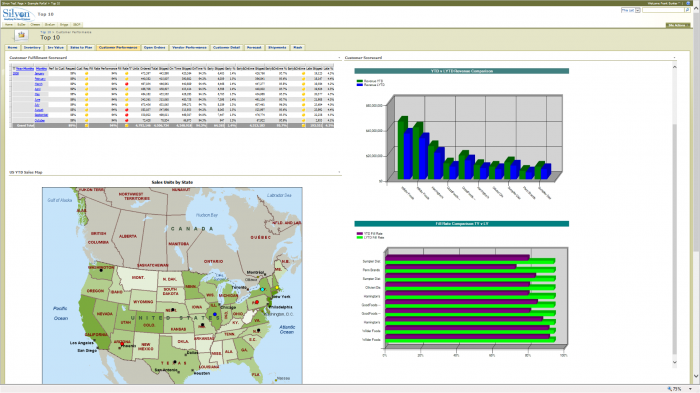
An effective dashboard offers drill-down paths that help maximize business information by presenting data from highly summarized to more granular levels. For example, in a drill-down dashboard like the one below, a user might click on a sales chart or map by region to better understand the distribution of sales in a particular territory by sales rep – and even further by customers in the rep’s territory. The use of drill-down dashboards then provides business managers with an effective means of better understanding what is (and isn’t) driving the business.
Unlike traditional BI dashboards, drill-down dashboards provide the user with an effective means of gaining greater insight into the business without having to go back to the IT or business analysts for more data. Traditional dashboards were designed to provide “snapshots” of information, mainly static data that was refreshed on a set interval. The use of drill-down dashboards, on the other hand, is helping to pioneer the concept of self-service or “agile” business intelligence with the goal of giving users the power to understand more real-time data on their own.
An effective drill-down dashboard also uses metrics that make sense and are meaningful to stakeholders and to the business. As Shaku Atre mentions in her article, How’s Your Business? Ask Your Dashboard, “dashboards can be an incredibly valuable and empowering tool for understanding critical business data in the metrics. The metrics used in the dashboard vary by industry and business function, as well as by the type of decision-maker and level of skill and tools used. They can be used for many functions, including planning, resource allocation, budgeting/forecasting, reporting, monitoring and analyzing, as well as strategy setting.”
One note of caution, though.
A large number of dashboards fail to achieve their intended goals because they boast too many metrics with no clear purpose of how to apply them. And with no context to the metrics or anything being done about them, users lose interest pretty quickly. In addition, the choice of measures should be based on providing information about managerial actions. Managers must be aware of how much success is due to their actions or they will not have the signals they need to maximize their effect on performance.
Fortunately, there are pre-built solutions available that embrace industry best practices to help companies get a solid start in the deployment and use of truly effective performance dashboards for their users.
